

I designed print and digital marketing collateral while bringing valuable HTML/CSS knowledge and video editing skills to the team—expertise that had been missing for over five years. By collaborating closely with the creative team and web developers from concept to completion, I helped the company regain control of the creative process. My contributions streamlined workflows, reducing the need for outsourcing saving both time and money. My role spanned UI/UX design, animation, illustration, and more, ensuring a seamless and engaging visual experience across digital and print platforms.
Instructional Video
Fluid Fighter Suction Canisters and Liners, Serial Connection
Role: Video Director & Editor
Tools: Miro, Adobe Premiere Pro
-
To create a clear and user-friendly video tutorial explaining how to set up a serial connection for the Fluid Fighter suction canister and liners.
-
I collaborated with the engineering and product teams to fully understand the setup process and identify key instructional moments. Using Miro, I developed a detailed storyboard to visually organize the video’s flow and content structure. Once approved, I directed the video shoot to ensure technical accuracy and effective visual storytelling. I then edited the footage in Adobe After Effects, focusing on clarity, pacing, and accessibility to produce a polished instructional video.
-
The final video provided customers with straightforward, step-by-step guidance for setting up the Fluid Fighter system, helping reduce setup errors and support requests. After release, customer satisfaction scores related to onboarding improved by 18%.
International Landing Page
Role: UI/UX Designer
Tools: Figma


-
Redesign the Typenex International page to improve usability, modernize the interface, and ensure accurate, up-to-date information is easily accessible for international customers.
-
Evaluated the existing page and identified key issues, including outdated branding, broken links, and information overload.
Simplified the layout by organizing countries into individual dropdown menus for easier navigation.
For each country, listed available products along with the corresponding distributor or company, ensuring each company name linked directly to their website.
Implemented hover effects on all links to improve interactivity and clarify clickable elements.
-
The redesigned page offers a cleaner, more user-friendly experience. Visitors can now quickly find relevant products and trusted local partners, with all links fully functional and visually identifiable. The update resulted in a more professional and intuitive interface, aligning with Typenex's brand standards and improving accessibility for international users.
Email campaign
Product Spotlight Series
Role: Design & Developer
Tools: Figma, VS Code


-
Create a playful email campaign series to build brand awareness and familiarity—without a sales pitch—by personifying key Typenex Medical products.
-
We kicked things off by brainstorming product personalities using ChatGPT—assigning zodiac signs, Myers-Briggs types, and quirky traits to bring our blood bank and lab products to life. From there, I developed visual concepts in Figma that leaned into playful character design and storytelling. Once the creative direction was locked, I hand-coded the emails in VS Code, ensuring clean formatting and responsive layouts for all devices.
-
The campaign was a hit—garnering a standout click-to-open rate and energizing internal teams. Each department is now eager for their own character-driven email series, and we’ve seen an uptick in website visits since the campaign launched.
Target Market Personality Guide

Role: Researcher & Designer
Tools: Adobe InDesign

-
To develop a comprehensive Target Market Personality Guide, enabling the marketing and design teams to create more tailored, impactful campaigns that resonate with our audience.
-
I began by conducting in-depth research, analyzing customer data, market trends, and feedback from sales and customer support teams to identify key audience segments. Using this information, I developed detailed personas, each highlighting demographics, behaviors, motivations, and pain points.
The guide was then designed in Adobe InDesign, incorporating clear visuals and data to make it an engaging, user-friendly resource for cross-functional teams.
-
The Target Market Personality Guide streamlined campaign planning and improved messaging consistency. Marketing efforts became more targeted, leading to a 15% increase in engagement rates across digital campaigns.


Product portfolio and datasheet
Suction Canisters and Liners
Role: Graphic Designer
Tools: Adobe InDesign
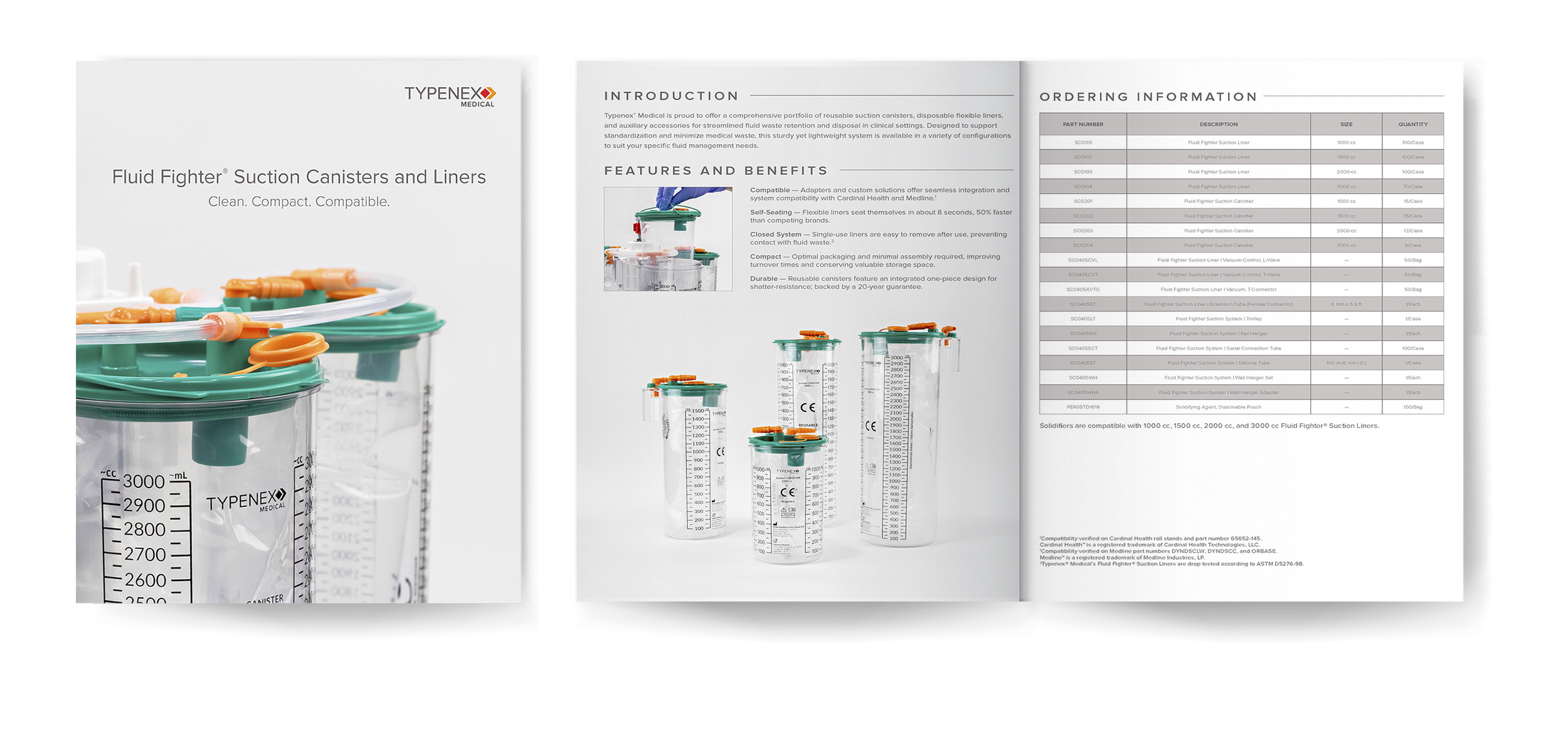

-
To create a comprehensive product portfolio and datasheet for suction canisters and liners, providing customers with a clear and professional reference for product specifications and benefits.
-
I collaborated with product managers to gather detailed technical information and key selling points. Using this input, I designed a clean, branded layout that prioritized clarity and visual hierarchy, ensuring easy navigation for users. Product visuals and charts were created to highlight features and streamline comprehension.
-
The final portfolio and datasheet enhanced sales efforts by equipping the team with a polished, easy-to-use resource. The document helped improve customer understanding of the product range, contributing to a 15% increase in product inquiries.
Email ADs
AABB Newsletter
Role: Graphic Designer
Tools: Adobe Illustrator


-
To create engaging digital ads for the AABB newsletter campaign that promoted Typenex Medical's blood bank solutions, driving brand awareness and encouraging clicks to explore products.
-
I concepted and designed two ad variations using Adobe Illustrator, highlighting Typenex Medical’s key messaging through bold headlines, clean product imagery, and accessible typography. I focused on maintaining brand consistency while creating visually compelling layouts optimized for busy newsletter environments.
-
The final ads effectively captured reader attention within the AABB newsletter, helping increase click-through rates and strengthen brand visibility among healthcare professionals. The campaign contributed to broader awareness efforts and reinforced Typenex Medical’s positioning as a trusted partner for blood bank solutions.
Social media post
Let’s Band Together
Role: Illustrator & Animator
Tools: Adobe Illustrator, Adobe After Effects
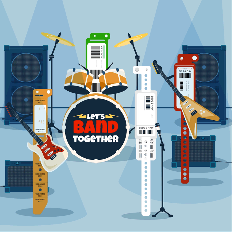
-
To create a playful and engaging social media post for National Blood Donation Week, celebrating the importance of donating blood in a memorable, shareable way.
-
I came up with the concept of "Let’s Band Together," imagining different blood types as members of a rock band to highlight the power of unity. After sketching character ideas, I created the final illustration in Adobe Illustrator, bringing the band to life with bold, energetic designs. To make the piece even more dynamic for social media, I animated the illustration in Adobe After Effects and turned it into a looping GIF that captured attention and encouraged sharing.
-
The animated "Let’s Band Together" GIF added a lively, creative touch to the National Blood Donation Week campaign. It sparked a boost in social media engagement and helped make the message of blood donation feel more relatable and fun for the audience.
Website Banner
Saved by the Lab 2024
Role: Illustrator
Tools: Adobe Illustrator


-
To create a playful and nostalgic banner for Lab Week 2023 that celebrates medical laboratory professionals while tying into the national theme, “Saved by the Lab.” The goal was to recognize the vital role of lab workers in healthcare while engaging Typenex’s audience in a fun and memorable way.
-
Drawing inspiration from the classic '90s show Saved by the Bell, I illustrated a vibrant, retro-themed banner that infused bold colors, funky patterns, and type reminiscent of the era. I incorporated lab-related imagery—like test tubes and pipettes—styled to match the theme, creating a visual fusion of pop culture and clinical precision. The illustration aimed to strike a balance between fun and professional, aligning with Typenex’s brand while resonating with lab professionals.
-
The final banner captured the energy of the Saved by the Lab theme and helped Typenex celebrate Lab Week in a way that felt both meaningful and fun. It was used across marketing emails and internal communications, sparking positive feedback from staff and customers alike, and boosting engagement during Lab Week festivities.
Email campaign
ArmorRx
Role: Designer & Developer
Tools: Adobe Illustrator, After Efects, Figma, VS Code


-
Educate potential leads about the benefits of ArmorRx—our alcohol-resistant pharmacy labels—and drive sample requests through a targeted email campaign.
-
I designed the email series in Figma with a clean, pharmacy-forward visual style to align with the product’s professional use case. To capture attention and clearly demonstrate the label’s durability, I created animated GIFs using Adobe Illustrator and After Effects, showing the labels in action. Each email focused on a specific product feature, building curiosity and credibility over the course of the series.
-
The educational approach paid off—we saw a clear increase in sample requests from new leads and strong engagement with the emails. The GIFs were especially effective, helping visually communicate the label’s unique alcohol-resistant properties at a glance.
Instructional Video
CultureSafe Culture Bottle Dispensing Device
Role: Video Director & Editor
Tools: Miro, Adobe After Effects
-
Develop a clear, professional instructional video to educate lab personnel on the features and use of CultureSafe, with the goal of increasing customer conversions.
-
I began by meeting with product managers to understand the product’s functionality and key messaging objectives. Using Miro, I created a detailed storyboard to map out the video flow and ensure visual clarity. I then directed the product video shoot and edited the final piece in Adobe After Effects, focusing on clean visuals and concise motion to effectively communicate the product’s benefits and usage.
-
The video played a key role in simplifying product education and driving conversions—leading to a measurable increase in customer adoption, with a 23% boost in conversions following its launch.
Sell sheet
Histology and cytology
Role: Graphic Designer
Tools: Adobe InDesign

-
To design a clear, professional sell sheet for Typenex Medical’s Premier Histology contract, highlighting key product offerings and exclusive member benefits.
-
Using Adobe InDesign, I designed the sell sheet with a strong focus on clarity, accessibility, and brand alignment. I structured the layout to prioritize key information — emphasizing product categories, contract details, and value propositions — while maintaining visual balance through strategic use of typography, spacing, and brand colors. I also ensured the design was optimized for both digital distribution and print formats.
-
The final sell sheet provided a polished, easy-to-navigate resource for Premier members, supporting sales conversations and reinforcing Typenex Medical’s reputation for quality and value. It helped drive member engagement and streamline access to exclusive contract benefits.
Sell sheet
Vein Therapy Solutions
Role: Designer
Tools: Adobe InDesign

-
To design an informative and visually compelling sell sheet for Typenex’s medical diode laser system. The goal was to clearly communicate the product’s key features, promote its value as a cost-effective, user-friendly solution, and support our role as an official supplier for Premier members.
-
Working within Typenex’s brand guidelines, I created a clean, professional layout using our signature vein therapy dark blue to ground the design and signal the product category. To add visual interest without overwhelming the content, I incorporated a subtly opaque background image near the top, giving the piece a more polished, high-end feel. The sheet featured well-organized comparison charts with accompanying product images, allowing for quick reference and easy differentiation between the three laser models. Supporting copy was strategically placed to reinforce product highlights—like the touchscreen interface, built-in test port, and industry-leading three-year warranty—while speaking directly to value-driven decision-makers.
-
The finished sell sheet effectively balanced clarity and design, helping sales teams present our EVLA solutions with confidence. It supported a strong brand impression, made technical specs easy to digest, and aligned with our messaging as a trusted Premier supplier offering quality, streamlined solutions to the healthcare market.
Seasonal Social Media GIFs
Role: Illustrator & Designer
Tools: Adobe Illustrator, After Effects

2023

2023

2024

2024
-
Share seasonal greetings and reinforce brand identity through engaging holiday-themed GIFs that highlight Typenex’s Chicago roots and signature color palette.
-
Each GIF begins with concept development and visual research to align with the seasonal theme. I create original illustrations in Adobe Illustrator, incorporating brand elements and subtle references to Chicago, then animate the assets in Adobe After Effects for a polished, platform-ready result. The process is both creatively rewarding and aligned with our brand’s visual strategy.
-
These GIFs consistently rank among our highest-performing social posts each year, driving strong engagement and reinforcing Typenex’s presence across digital channels.
UI/UX Case Study
Advanced Search for Patient ID Products
-
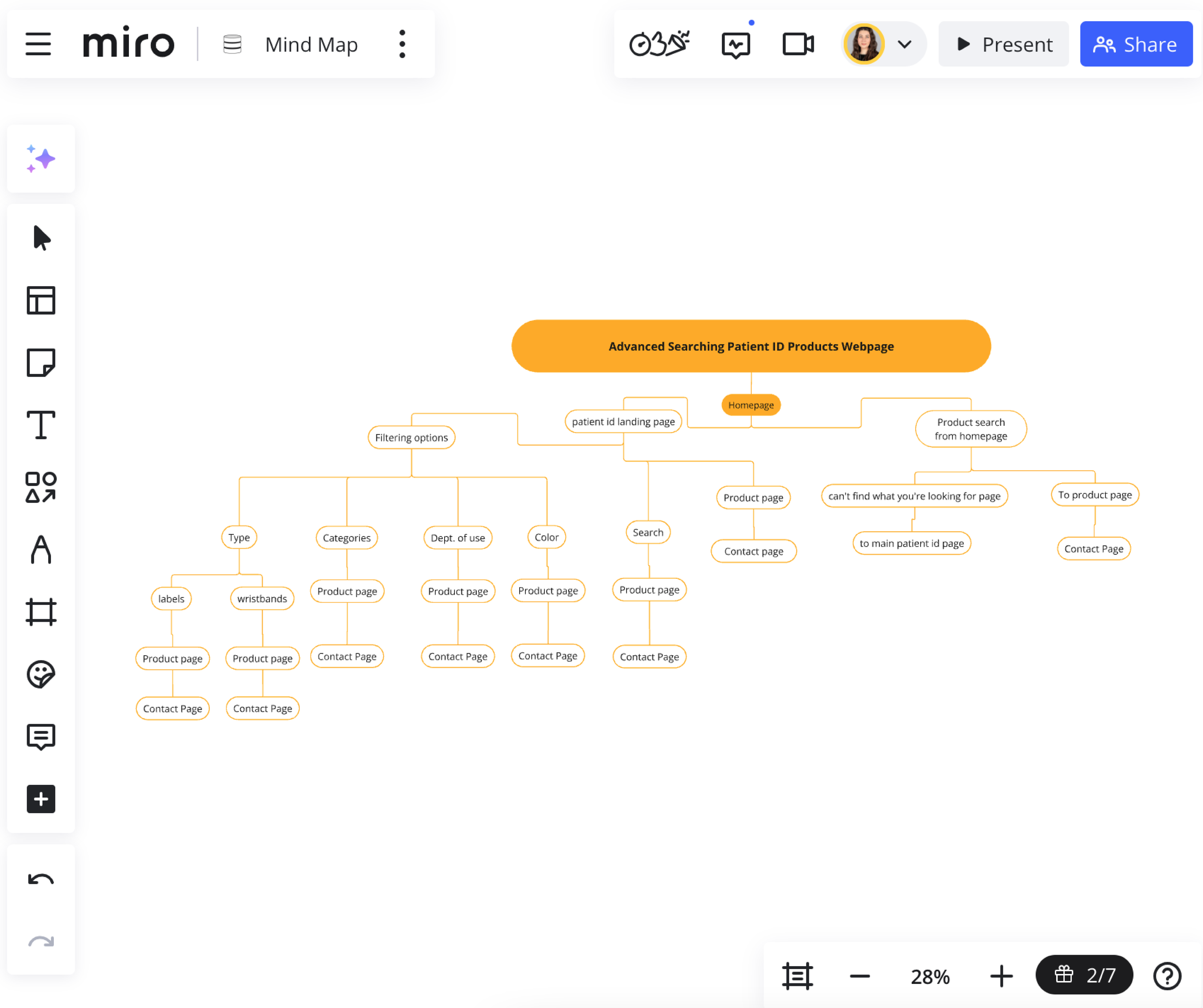
![Patient ID Advanced Search Page Site Map]()
Site Map.
-
![Patient ID Advanced Search Page Wireframe]()
Wireframe.
-
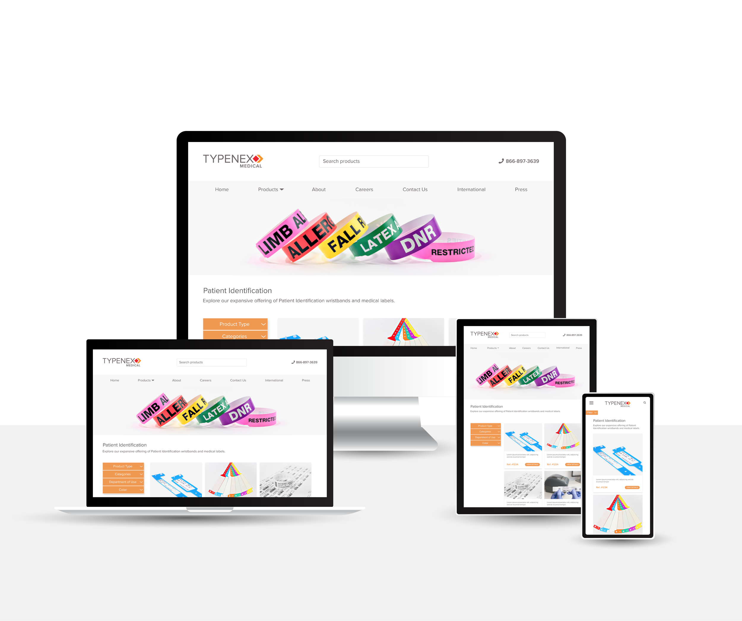
![Patient ID Advanced Search Page landing page]()
Landing Page.
-
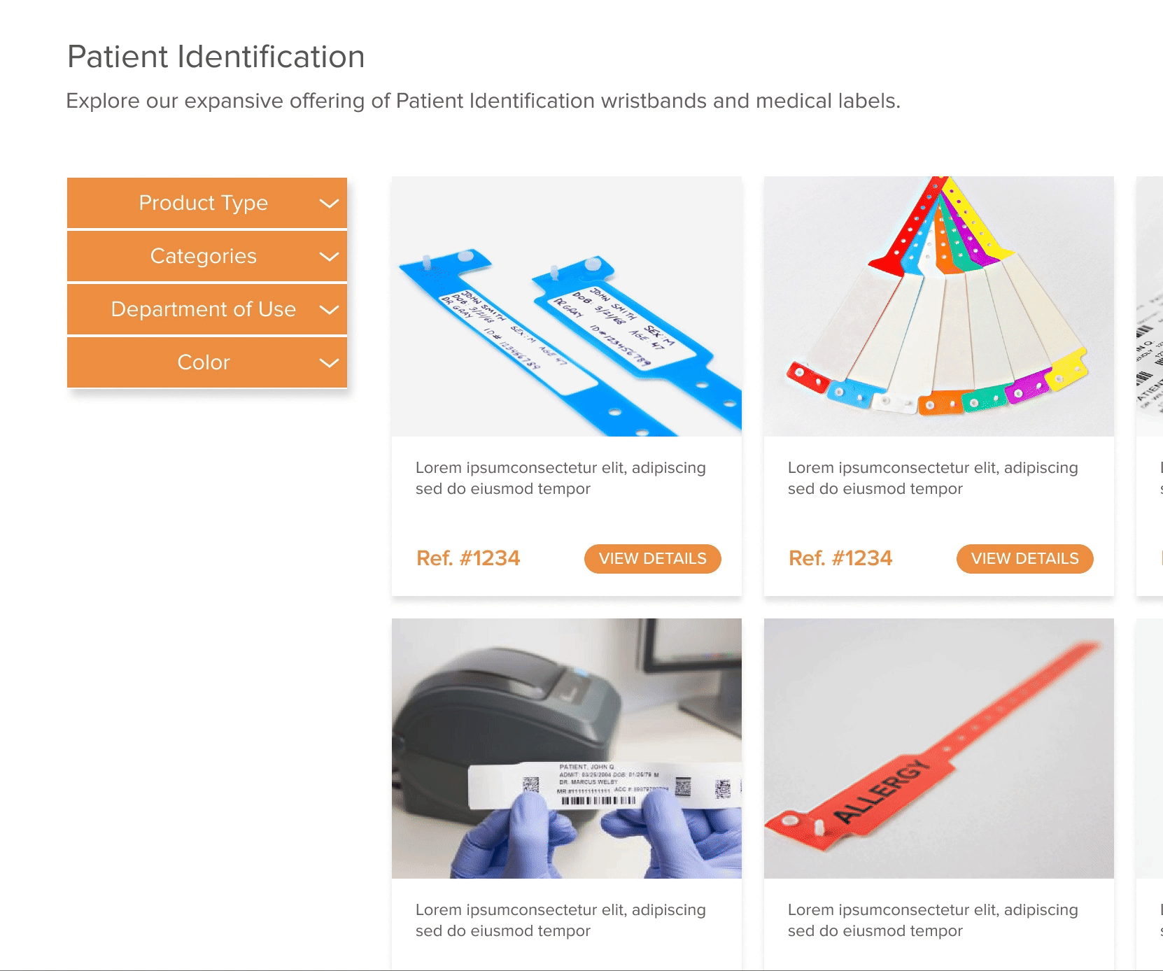
![Patient ID Advanced Search Page Filter Menu]()
Filter Menu.

Project Overview: To design a user-friendly, branded webpage for advanced searching of patient ID products, ensuring functionality aligned with our competitors while maintaining our unique brand identity.
Role: UI/UX Designer
Tools: Miro, Figma, VS Code
-
Our company lacked a dedicated tool for users to search for patient ID products by product numbers—a feature already implemented by competitors. The goal was to create a seamless, intuitive search experience that catered to our user base and integrated well with our existing site structure while prioritizing ease of navigation.
-
I conducted a thorough review of competitor websites to understand their search functionality, layouts, and user flows. I noted the strengths and weaknesses of each implementation to craft a solution that was intuitive yet differentiated.
User Feedback:
Collaborating with customer service and sales teams, I gathered insights into common user pain points and expectations for product search functionality.Key Insights:
Simplicity is Key: Overly complex interfaces deter users.
Brand Integration Matters: Visual consistency across the site builds trust and reinforces branding.
Mobile-Friendly Design: Many users access the site via mobile devices, making responsive design essential.
Information Architecture:
To ensure a seamless user flow, I started by creating a sitemap to define the page hierarchy and navigation structure. This provided a clear framework for how users would interact with the search functionality. Additionally, I conducted a card sorting brainstorm to organize content in a way that felt intuitive to users, prioritizing ease of access to key product information. These steps laid the foundation for wireframing and prototyping, aligning the design with both user expectations and business objectives. -
Wireframes:
I began with low-fidelity wireframes to map out the basic structure and layout of the search page. The focus was on creating a clean interface with:Advanced filtering options for product categories, features, and availability.
Clear results with concise product descriptions and visuals.
A CTA button that directs users to the contact page, pre-filled with the selected product number for streamlined inquiries.
Prototyping:
Using Figma, I created high-fidelity prototypes incorporating our brand colors, typography, and design elements.User Testing:
I conducted usability tests with internal stakeholders and team members to refine the flow and ensure it met user expectations. -
I worked closely with the IT department to ensure the design was aesthetically appealing and technically feasible. Through an iterative process, we addressed potential challenges, such as:
Data integration for search functionality.
Ensuring fast load times for results.
Responsive design across devices.
Final Design Features:
Intuitive Search Bar: Positioned prominently for easy access.
Advanced Filters: Users can narrow results by product type, compatibility, and other attributes.
Responsive Design: Optimized for desktop, tablet, and mobile use.
Results Page: Clean and organized with product images, descriptions, and links for detailed information.
-
While the page is not yet live, the project is complete and awaiting deployment. Internal reviews have praised the design for its simplicity, usability, and alignment with our brand identity. This page positions our company to better compete in the market by providing a highly requested feature.
Takeaways:
This project reinforced the importance of:Balancing user needs with business goals.
Collaborating across departments for a seamless implementation.
Iterative design to refine and improve user experience.